


The psychology of design
6 Simple Psychology Principles That Will Transform Your Learning Platform
UX Design
Are you an HR director looking for new ways to keep your staff engaged in their learning and development?
Are you concerned that your staff are going through the motions when it comes to their learning, treating it as a box-ticking exercise and, crucially, not actually taking on board the information they need to continue to improve and grow?
Do you want to deliver an engaging learning environment that will exceed your ambitious team’s expectations?
If so, this piece will help to show you that there are actually some really simple, but powerful, principles we can apply to your company’s learning environment that can completely transform your team’s experience of working for you.
We work with HR leaders like you to create digital experiences that lead to positive behaviour change within your team, which improves performance, culture and staff retention.
It’s absolutely achievable to turn your organisation’s learning platform from unengaging and overwhelming to exciting and addictive.
The best part? The concepts we can use to set this transformation in motion are all backed by decades (sometimes centuries) of scientific study.
As designers, psychology plays a huge role in the work we do every day.
We have to remember all the time that our users are human. And so we need to tap into the aspects of our psyche that make us uniquely human when designing engaging experiences.
Outside of work, our favourite apps, platforms and games, like Netflix, Twitter, Instagram, TikTok and Mario Kart Tour all apply psychological principles to keep us coming back for more day after day.
And there’s no reason why we can’t apply these same principles to your learning platforms.
So, read on to discover the 6 key principles that will ensure the very best experience for your people and help them develop, grow and thrive in your organisation faster and more effortlessly than ever before.
Step 1
As designers, nearly every client we work with requests “more content above the fold”. What this means is presenting important information to the user prominently, quickly and with less work required by them to access it.
While the thought behind this is right, we have to be really careful about how we go about it to get the intended result, which is users accessing the most powerful content before they get overwhelmed, confused or bored.
Because if we’re not careful, we can actually have the opposite effect.
If you have too many processes running on your phone or laptop, it’ll start to struggle, slow down and crash. Well, we run the risk of doing this to your user’s brain by squeezing lots and lots of content into the top section of your web page or platform. This leads to users having to stop and figure out what to do next, often leaving them on the brink of abandoning the whole process.
This is called ‘cognitive overload’.
As designers of learning platforms, we have one job: to make your users’ experience as simple and engaging as possible.
We don’t want to make them work too hard for the content they need, so serving less at any one time is actually a lot more practical and effective.
Thankfully there are simple ways to reduce cognitive load while still getting your key messages across and guiding your people to your most important content.
Here are some examples of practical things we can do to achieve that:
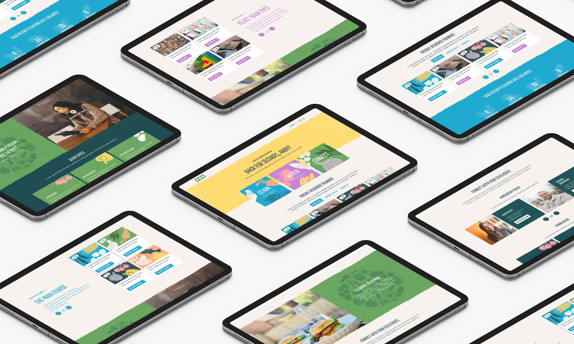
Click on the button below to see how we applied these principles in our work for Nomad Foods…
Step 2
The concept of positive reinforcement has been around for a long time.
Remember Ivan Pavlov and his famous experiment with hungry dogs back in 1897?
Pavlov rewarded his dogs with food after ringing a bell, and taught them to associate the ringing of the bell with being given food.
When they heard the bell, they would salivate in anticipation, and then be rewarded with food.
The salivation was the response, and the food was the reinforcer. This was an example of positive reinforcement, because the dogs were given something to increase the chance of the response.
Why is this important? Well, we can use positive reinforcement principles in UX design to better engage our users. This allows for a much more pleasant experience and increases the chances of them taking the actions we want them to take more often.
For instance, if a user completes an important action that we want them to take, we can share messages saying “thank you”, “success!” or “congratulations”.
Rewards and achievements also fall into the category of positive reinforcement. Examples of this include allowing users to unlock new levels of achievement, earn badges, points and credits.
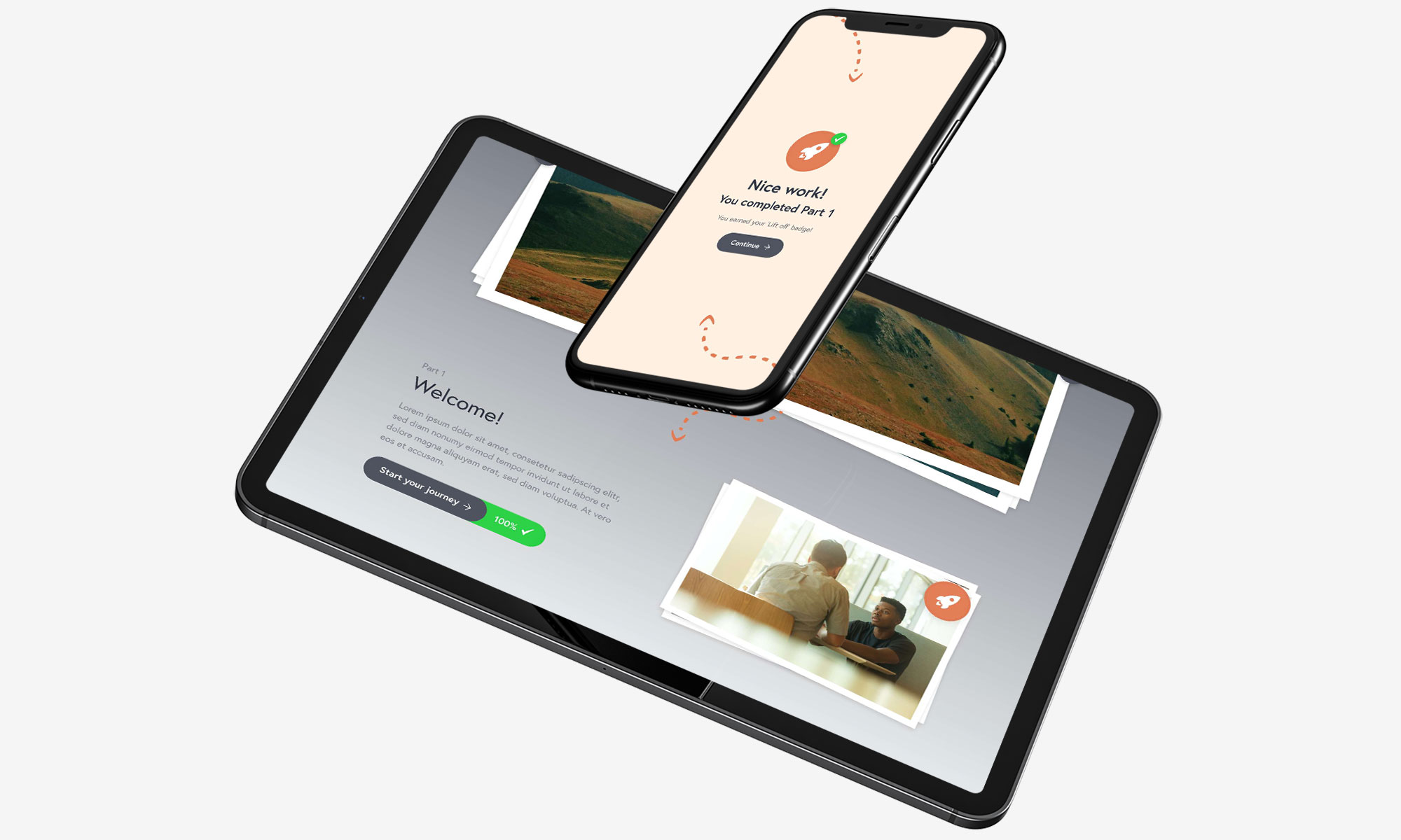
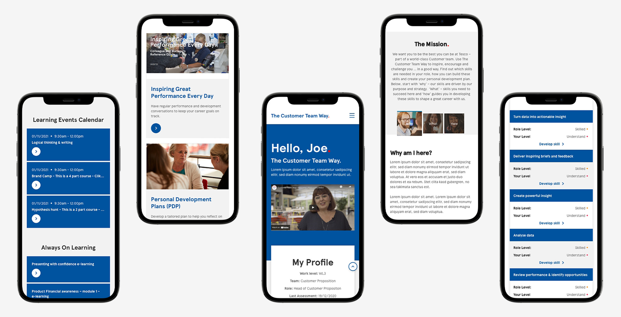
We had these principles in mind whilst designing this digital onboarding experience…
Step 3
Our users are much more likely to engage with our platforms if they feel the platforms have been designed with them and their specific social identities in mind.
Everyone is different, so that can be a real challenge for designers and HR leaders alike. How do you create an inclusive, accessible design when you consider the following statistics?
What do we mean when we say inclusive, or accessible design?
Inclusive design means reducing the risk of alienating any social identity, such as gender, age, sexual orientation, language, disability, race or ethnicity. In other words, it means speaking to, and representing, all your people.
Some examples of how this can be achieved includes:
Accessible design means reducing the barriers to accessing content and features regardless of an individual’s permanent, situational or temporary disabilities.
Examples of accessible design elements include:
The key here is to truly understand your users – in all their different forms – and understand what might make them feel overlooked. After all, if someone feels overlooked or alienated by their experience, they will likely not continue to engage with it – the opposite of what we want!
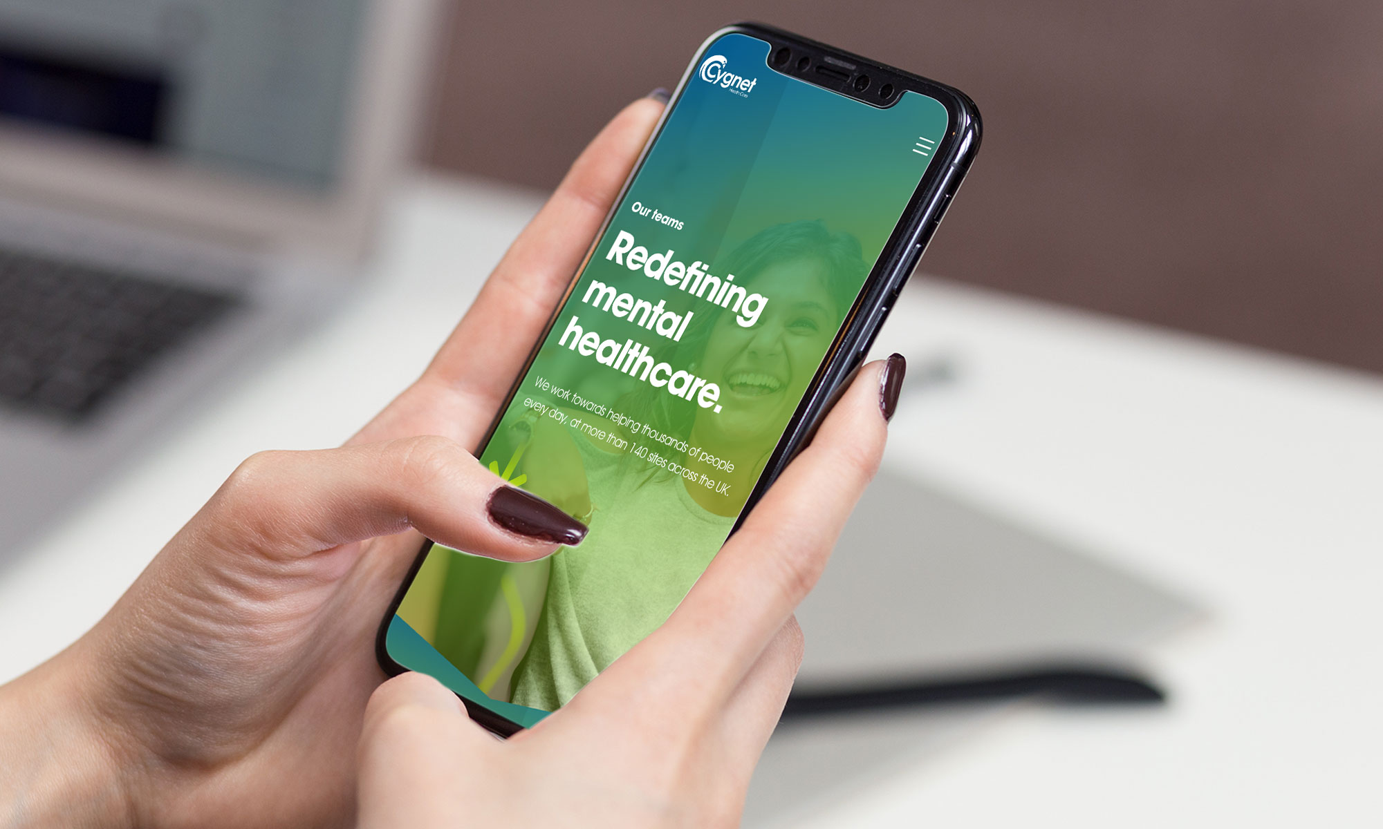
To give you an idea of how inclusivity and accessibility can be built into UX design, click the button below to take a look at what we did for Cygnet Health Care Careers…
Step 4
Hedonic adaptation sounds extremely technical, but in reality the concept is quite simple.
It describes how humans tend to become insensitive to new stimuli over time, and quickly return to their emotional baseline.
This means that the stimulus required to create an emotion, like happiness or excitement, must be more intense than the last stimulus in order for its effects to be felt.
To give you an example, imagine you purchase a new phone, which you think will give you pleasure.
To begin with, it does make you feel happy, but over time you become accustomed to it. Eventually it adds no extra enjoyment to your life and you feel exactly the same as you did before you bought the phone.
This happens to users all the time – and is something we need to take into account when designing learning experiences and platforms.
We should expect every user to want something else as soon as they get used to how our platform makes them feel, and gradually become less and less excited and interested by every new feature we add.
What does this mean for us?
It means we need to keep the platform fresh and introduce new updates and features regularly and consistently in order to keep users engaged over a long period of time.
Take Fortnite for instance, arguably one of the most popular video games of all time. The game has been updated on average once a week since its launch, adding huge numbers of new and varied features so that key aspects of the game are now almost unrecognisable from when it was first released.
Here’s how we keep this self evaluation tool fresh with regular updates & UX improvements…
Step 5
You’ve probably heard this term a lot, but might not be completely sure what it means.
In short, it means applying mechanics of games into a non-game environment, such as a learning and development platform.
Gamification allows us to introduce positive reinforcement, like we discussed earlier, by offering rewards for taking certain actions – which typically happens in games.
But we can go further than that. Other gaming elements we can introduce to our platform could include:
Or we might want to actually build complete games into our platforms to make learning even more fun, and the information even more embeddable in our users’ minds.
Because the science tells us that games are an incredibly powerful way to increase engagement – and repeat engagement – among users.
Although training may have historically required lots of reading and watching of content, with little interaction or engagement, it doesn’t mean it needs to be like that forever. Today, we have incredible technology at our disposal that means we can make learning an immersive experience and generate amazing results by delivering content in a more dynamic way for our people.
Games encourage the release of dopamine – the chemical in our bodies responsible for making us feel happy – and activities that increase our dopamine levels are much more attractive to humans than those that don’t. If something makes you feel happy, why wouldn’t you want to do it again?
It also taps into humans’ natural competitiveness – both with themselves and with each other. Games are a great (and easy way) for people to scratch their competitive itch, but it also keeps them coming back for more time after time, as they’re more likely to put effort in in order to ‘win’ something.
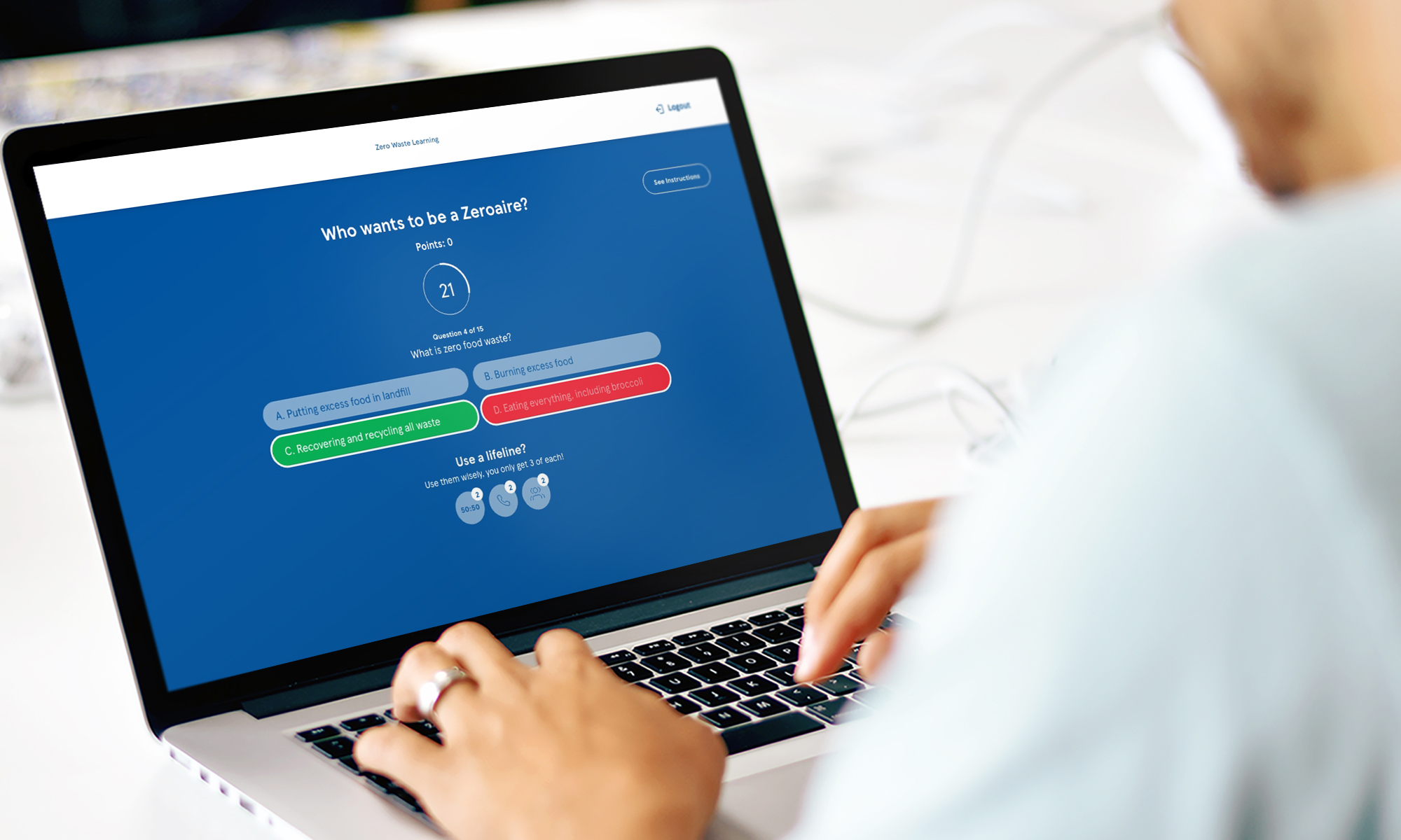
Check out the gamification elements we built for a sustainability training campaign…
Step 6
When humans consume content online, they tend to scan, rather than read every word on the page.
The research consistently shows us that users only read a small fraction of the words written on a piece of digital content. Instead, they’re scanning the content – looking for signals and keywords that might match the information they’re looking for.
And this has been the case for over 20 years, so we shouldn’t expect this behaviour to change any time soon.
It’s clear from this research that users want to find the content that is most relevant to their own personality, interests, role or preferences. And if they don’t find it quickly, they’re likely to disengage and leave (remember cognitive load, which we discussed earlier?).
So as designers, we need to make sure we personalise each experience as much as possible, only serving the most relevant content to individuals wherever we can.
And we need to learn continuously as their interests and preferences change.
That’s why Netflix’s homepage is a curated list of titles that they believe you will enjoy, so you can find content that you enjoy quickly and ultimately spend more time on the platform.
The more individual the personalisation, the better. However, HR leaders may want to consider personalising experiences for larger groups of people. For instance, they could serve specific content to team members based on their level of experience, department or motivations.
And there are a few clever ways that we can do this.
One way is to serve users with an interactive onboarding system that asks them to select their interests or preferences from the outset.
For instance, Spotify asks new users to select artists or genres they like, and music is suggested to them based on their selections. Additionally, growing numbers of platforms and apps build this onboarding experience into a fun quiz or survey.
And over time we can continue to update the ‘model’ of that specific user that we initially built, by paying close attention to the content that they engage with on our platform on an ongoing basis.
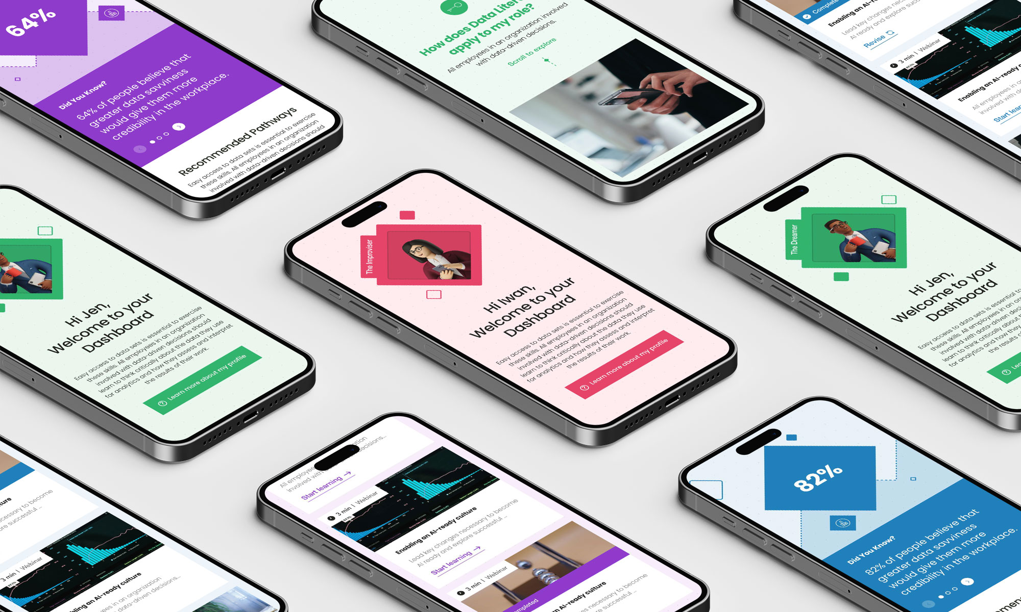
Look at how we utilised personalisation in our project for an international law firm…
These are just 6 fundamental principles of psychology that we can apply to our UI/UX design to create happier, more engaged users.
And for HR leaders that means increased performance, better retention, improved job satisfaction and the elimination of a whole host of challenges faced by those responsible for people.
The key thread of this piece is that we need to remember that, although we’re working with technology, our users are human.
But if we can maintain this understanding of basic human psychology when building our platforms together, we can create incredibly powerful learning systems that positively change our people’s behaviour and inspire them to thrive and grow.
Enjoy what you’ve read? Download the guide here: EC 6 Psychology Principles
At Electric Circus we’re an experience-led team. We understand the challenges of recruiting, retaining and developing talent. Our expertise blends creativity, digital solutions and communications strategy to create experiences that engage and connect with your employees through every phase of the talent lifecycle.
Whether you’ve read something intriguing about what we’ve done for other companies, or you’ve got a challenge that you can’t get your head around. Or even if you just want to know where we got our name.
We’re always happy to chat. Get in touch below.