


Best practice
A Best Practice Guide To Creating Webforms
UX Design
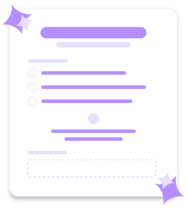
Step 1
Step 2
Step 3
Transform your webform experience & increase conversions
Step 1
Many UX researchers have found that this increases form completion time because the forms are easier to read an more accessible to users.
Step 2
Eye tracking studies show that, unless it is features such as a first name & surname or a date, one column forms are much easier to navigate and complete for our users.
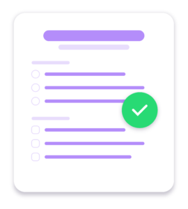
Step 3
This simple layout rule will ensure that your radio buttons and checkboxes are faster to process for your user, reducing cognitive load massively.
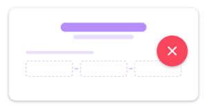
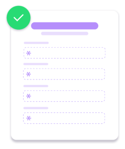
Step 4
This means the user has to make unnecessary extra clicks to get to the next field, therefore increasing cognitive load – the opposite of what you want to achieve. A better way to do it is to have one single field with a clear guidance in the field.
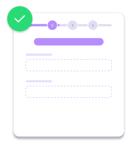
Step 5
UX research has proven that splitting your form into two or three steps (depending on the amount of fields, of course) increases completion rate, almost every time.
Step 6
People are increasingly less happy handing out their phone numbers. One study by Clicktale found the marking the phone number file as optional decreased form abandonment rate from 39% to 4%.
Step 7
It has been proven that people trust beautifully designs forms more than forms that don’t look as impressive.
Step 8
Travel company Expedia lost $12 million per year by asking one additional question (company name) in their booking form. Every additional file in your form is losing you leads.
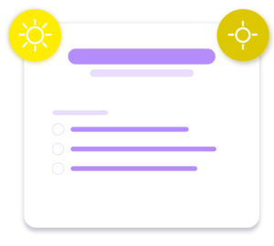
Step 9
If people are likely to use your forms outdoors on their mobile devices, you may need to ensure that your question fields contrast against the form backgrounds and can be seen in harsh or bright lighting.
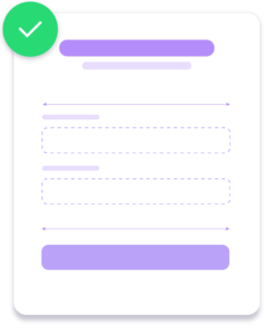
Step 10
Uber forms use large full-width call to actions that are highly contrasted against the form backgrounds. By making call to actions the same width as fields you remove any doubt over where the button is located for a user.
At Electric Circus we’re an experience-led team. We understand the challenges of recruiting, retaining and developing talent. Our expertise blends creativity, digital solutions and communications strategy to create experiences that engage and connect with your employees through every phase of the talent lifecycle.
Whether you’ve read something intriguing about what we’ve done for other companies, or you’ve got a challenge that you can’t get your head around. Or even if you just want to know where we got our name.
We’re always happy to chat. Get in touch below.